
It is common to encounter Power BI reports filled with an abundance of numbers, tables, and charts. While this wealth of information is valuable, it can easily become overwhelming if there is no clear narrative thread. Data, in fact, do not speak for themselves: they need a story that guides the user from the initial context to a well-defined decision.
Nevertheless, storytelling often remains an underestimated element. Attention tends to focus on the sophistication of models or the aesthetics of charts, neglecting the fact that, without an effective narrative, the report risks remaining a mere static collection of data.

It’s like opening your GPS and seeing the map without a highlighted route: you see all the roads, but you don’t know which one to follow.
Thinking of a report as a journey can offer a more functional perspective.
It is advisable to provide a concise map that presents an introductory overview, without including every detail, so that the user can quickly orient themselves. Next, you develop the intermediate steps, during which the data are progressively analyzed, always maintaining a coherent guideline. If your report were a journey, would the reader reach their destination or get lost along the way?
In this process, filters and buttons act as companion tools, facilitating the user’s navigation. Each section of the report should be designed to answer specific questions, thus contributing to the construction of the narrative.

As in any journey, the final stage is fundamental. Whether it’s a final page, a summary section, or highlighted KPIs, the objective must be clear: to guide the user toward the next decision. This is where the crucial question that every report must answer comes into play: “What is the next action to take?” In this way, storytelling transforms data into decision-making tools, going beyond their nature as simple indicators.
In addition to the narrative logic, some visual elements make a difference. The choice of colors, for example, is never neutral: using too many different tones risks creating confusion, while a consistent palette unconsciously guides the eye toward what matters. Warm colors can highlight critical issues or alerts, while cool tones convey stability and help distinguish contextual information from operational data. Likewise, the conscious use of white space prevents overcrowding and helps the user “breathe” between pieces of information.
Visual hierarchy is also an integral part of the narrative. Clear titles, different sizes for main and secondary KPIs, essential icons: small details that help transform the report from a simple container of numbers into a guiding tool. A data point without visual emphasis can go unnoticed, while the same data, if positioned and colored correctly, immediately becomes a call to action.
When a narrative structure is missing, reports appear disorganized and lack a guiding thread, similar to mere encyclopedic entries. Isolated KPIs without explanation, pages without concluding messages, inconsistent colors that confuse rather than clarify: all issues that undermine communication effectiveness and leave the user without guidance.
An effective Power BI report should be conceived as a structured guide: it starts with an overview, continues through clear steps, and ends with a concrete objective. Only in this way do data acquire meaning, evolving from simple static numbers to key elements of an informed decision-making process.
Storytelling, therefore, is not a useless embellishment: it is the compass that makes data readable, useful, and actionable.
To better understand the impact of storytelling, let’s look at three concrete examples.
Chart 1 – Revenue KPI
Without storytelling (first image), the number and percentage are shown neutrally, without helping interpretation.
With storytelling (second image), the growth is highlighted by the green color and the arrow icon, making it clear that 9.17% is a positive improvement. The data doesn’t change, but its readability does.
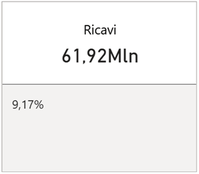
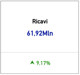
Chart 2 – Distribution by Product
Without storytelling (on the left), the reading is dispersive: the donut chart contains many similar slices, and the values are hard to compare.
With storytelling (on the right), the same information is transformed into an ordered bar chart, immediately highlighting the two main products (A and B) and visually resizing the impact of all the others.
👉 This example also shows how crucial it is to choose the most suitable chart type: a donut chart may look appealing, but it doesn’t always facilitate comparison. The bar chart, instead, immediately highlights the differences in weight between categories, making the message clear.
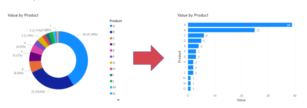
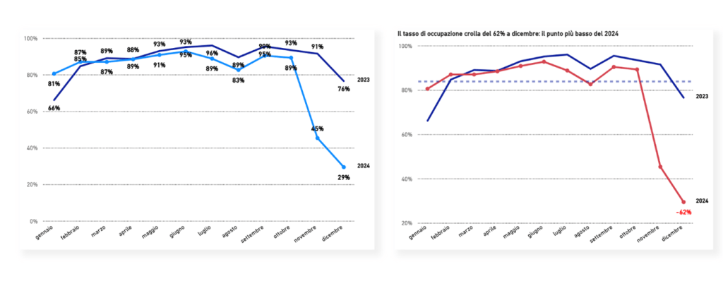
Chart 3 – Occupancy Rate
Without storytelling (on the left), the drastic drop in 2024 is visible, but remains “just one of many values” in the chart.
With storytelling (on the right), the drop is emphasized: red color to highlight the loss, a caption explaining the -62%, and a dashed line as a reference. The user doesn’t have to interpret: the message is immediately clear and prompts them to ask why that result occurred.
(written by Dina Fiorentino)
Boom, done 💣!
Follow me:

Leave a comment