
Every business decision begins with data-driven insights. However, trying to spot trends while staring at rows and columns of data is not exactly the most efficient way to gain information. Manually exporting data, creating charts, and adjusting filters can be time-consuming, creating spreadsheet fatigue.
What if you could skip all this tedious work and go straight to insights?
Visualize with Copilot: A Revolutionary New Feature
Microsoft is introducing Visualize with Copilot, a new feature that instantly transforms business data into meaningful interactive charts.
Simplified Data Exploration
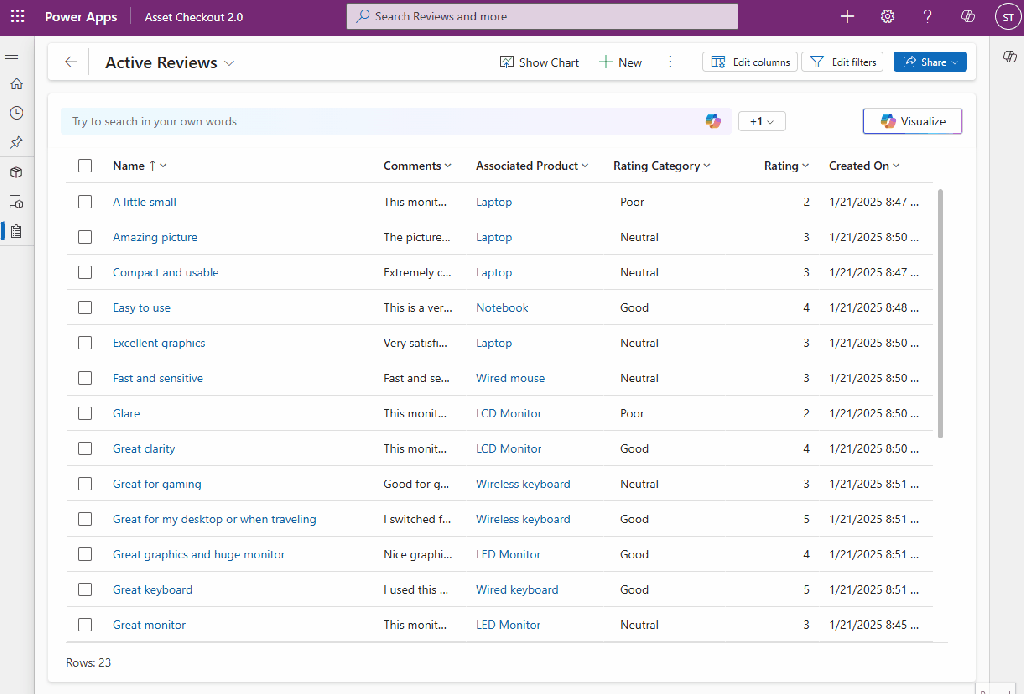
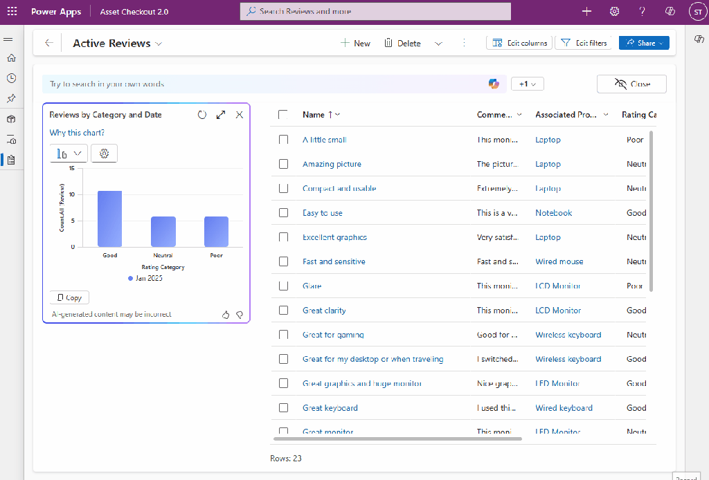
Data exploration can involve manual steps like exporting data to a spreadsheet, creating reports, and adjusting filters. With the Power Apps data exploration agent, you can now visualize your data as a chart to spot trends, patterns, and relationships with just one click. Each visualization comes with an AI-generated title and a clear explanation, providing the full context of the thought process.
Easy Customization of Visualizations
The data exploration agent works for you, making it easier than ever to refine and customize the AI-generated visualization with just a few clicks. You can change the chart type, adjust columns, or modify the aggregation to fit the chart to your preferences.
Dynamic Interaction with Data
Data exploration is more powerful when the visualization is interactive, supporting drill-downs. With the AI-generated visualization dynamically linked to the grid, you can interact with your data seamlessly. Select a segment of the chart to filter the grid, refine your focus, and analyze the data in real time. Along with natural language filtering, just type what you need, and the data exploration agent will filter your grid and update the chart, transforming raw data into meaningful insights.

How to Get Started with Visualize with Copilot
To use Visualize with Copilot in your model-driven apps, update the following two feature settings in the Power Platform Admin Center:
Under “Natural language grid and view search,” set “Enable this feature” to “All users immediately.”
Set “Allow AI to generate charts to visualize the data in a view” to “On.”
This feature, rolled out with build 9.2.25013, is currently being deployed and is expected to be available in all regions worldwide by the end of the month.
Conclusion
Visualize with Copilot represents a significant step forward in data exploration, making it easier and faster to gain meaningful insights from your business data.
Boom Done 💣
Follow me:

Leave a comment